






From Query to Curriculum: Redesigning Yooki's Conversational AI from a Doubt-Solver to a Daily Study Habit
Most UPSC aspirants weren't struggling to find facts. They were struggling to navigate the cognitive overwhelm of a 3-year preparation syllabus. This is the story of how we uncovered the transactional trap of conversational interfaces and restructured Yooki to guide aspirants through their learning journey.
But supporting learning is a human, behavioral challenge.
When a 90% Success Rate Hides a Retention Crisis
Yooki was a powerful AI learning platform. It could answer difficult UPSC questions about subjects like Polity and History with great accuracy. It also performed well in the CSAT exam. But when we looked at the user data, we found a big problem. Most users came to ask one question, got the answer, and left the app right away.
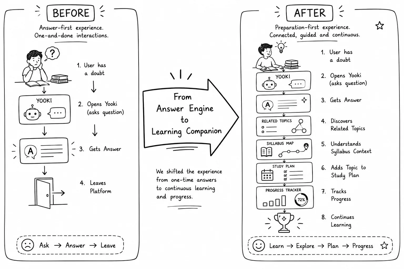
Instead of helping users learn over time, the chatbot was being used like a quick search tool. Whenever students had a doubt, they asked Yooki, got an instant answer, and closed the app. It was solving problems quickly, but it wasn't encouraging users to stay, explore, or continue learning.
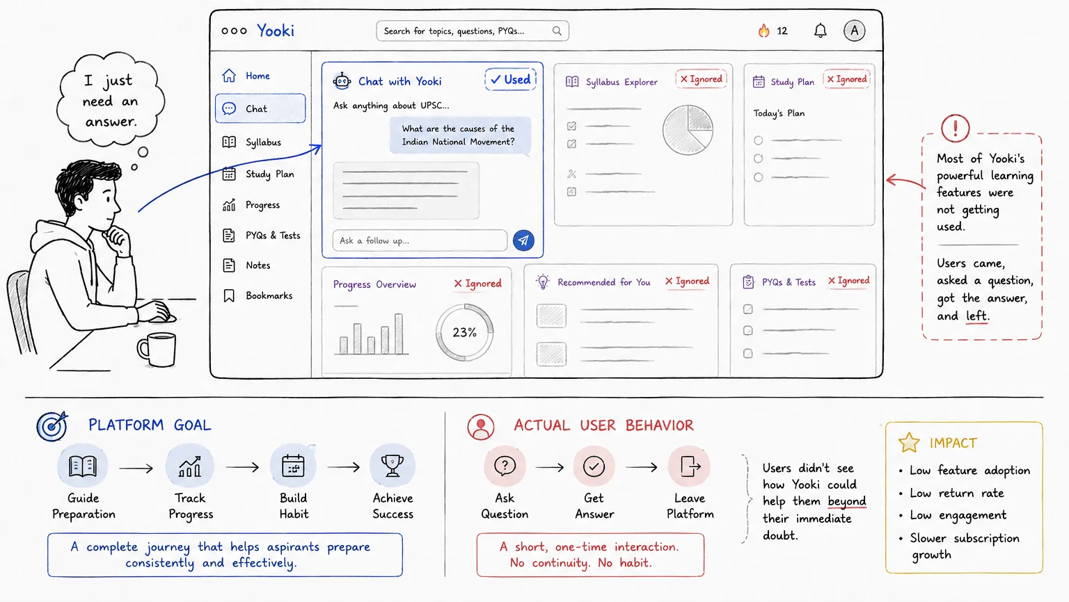
"Traditional UX teaches us to reduce friction and get users to their goal as fast as possible. But in Yooki, getting the user to the answer too quickly ended the interaction, destroying any opportunity to build a daily study routine."
Challenging the "Better Chatbot" Assumption
Initially, the product direction leaned toward optimizing the chatbot: training better models, introducing suggestion chips, or making chat history easier to search.
To test this, we conducted moderated Maze usability testing with 8 active UPSC aspirants. The sessions revealed a deeper friction: **the interface wasn't the obstacle; the cognitive load of the exam was.** Aspirants had mind maps on their walls, stacks of books on their tables, and spreadsheets tracking syllabus percentages. They didn't need another chat dialogue box—they needed a system that mapped Yooki to their real study room layout.
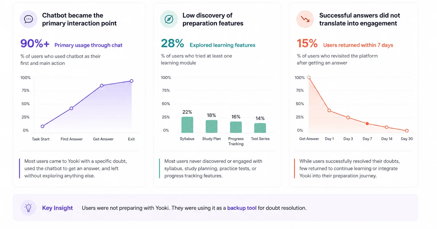
"Aspirants were suffering from 'syllabus anxiety'. Finding a single answer relieved query pressure temporarily, but it didn't solve the underlying problem of structuring their next 30 days of study."
The Turning Point: Shifting from Answers to Alignment
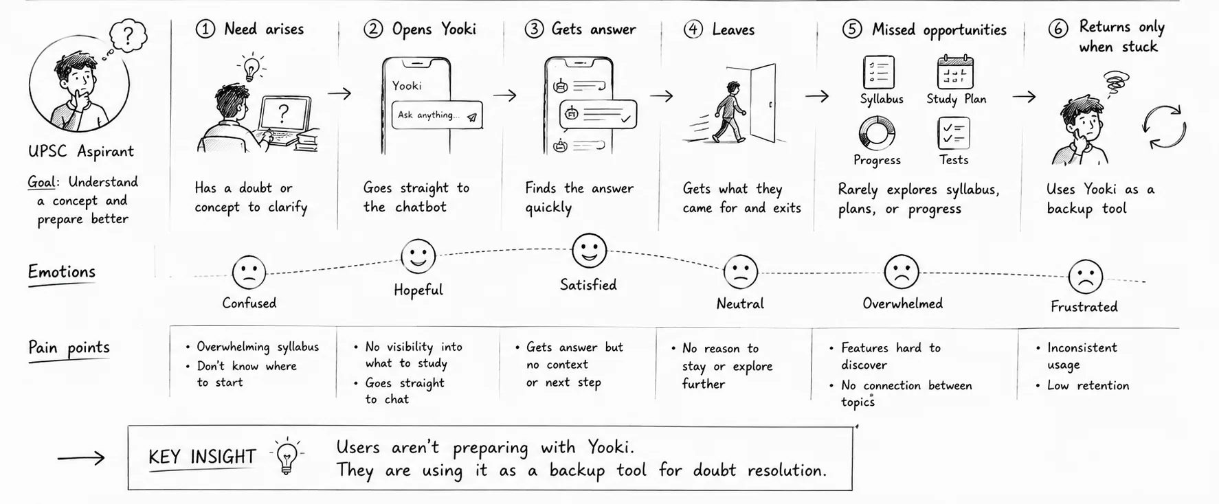
Mapping out the general user journey revealed the breakdown. Users visited Yooki during moments of friction—while reading a book or revising. Once Yooki answered the doubt, the user returned to their study room ecosystem. There was no bridge keeping them on the platform.
This insight shifted our priorities. We stopped focusing on improving chatbot responses. Instead, **we focused on building the bridge: connecting the transactional chat interaction directly to their visual progress tracker.**
Syllabus Contextualization
Embed every chat answer within the visual syllabus hierarchy, instantly showing the user its significance.
Habit-Driving Nudges
Transition users from a simple "resolved" status to recommended next actions based on their current progress.
Progress Dashboard
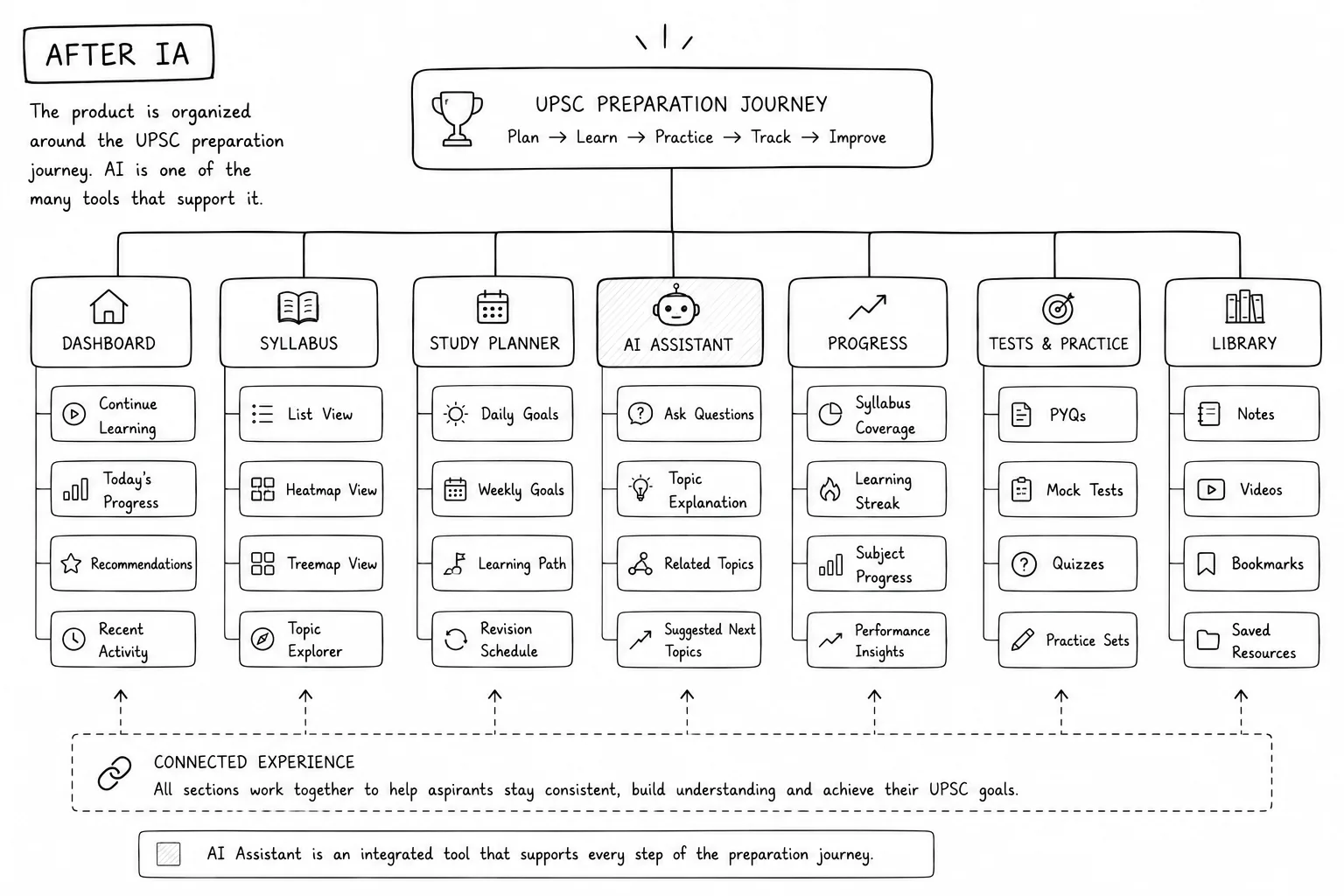
Reposition the chatbot as one feature inside a broader preparation cockpit that visualizes study coverage.
Associative Exploration
Expose cross-subject concept links (e.g., how History links to Economics) to encourage broader learning paths.
Designing for Cognitive Calm
With hundreds of syllabus topics, simply listing them would overwhelm aspirants. We structured the IA to group content under high-level subjects (Polity, History, Economics, Environment) and mapped the AI dialogue box as an associative overlay rather than a standalone container.
The Root Cause: Answering Questions is Not the Same as Guiding Learners
Why were users leaving despite receiving great answers? Deep analysis of drop-off points and interview transcripts exposed three critical structural issues:
The Rigid Track Bias
Traditional learning apps force a linear subject order. However, UPSC aspirants study dynamically—jumping between news stories, current events, and theory. The app structure resisted this natural movement.
Information Without Position
Every AI response solved a doubt but remained isolated. Users couldn't see the context—which General Studies paper it belonged to, or how it impacted their syllabus completion targets.
The Conversation-First Interface Illusion
By presenting a clean ChatGPT-style interface on launch, Yooki gave the impression that it was just a doubt box. Users never discovered that they could track, plan, or map progress inside the app.
The Strategy: Transforming Chat from a Destination into a Gateway
We shifted Yooki's paradigm: instead of treating chat as the primary screen, **we built a preparation ecosystem where conversational inputs serve as entry points to structured learning.**
Every time an aspirant asks a question, Yooki answers the query, highlights its position within the syllabus tree, and prompts them with custom next actions. This turns conversational queries into structured study habits.
The Hard Choices: Rigid Curriculums vs. Sandbox Exploration
We evaluated three primary system designs. Balancing business goals, engineering constraints, and study habits required making compromises:
Linear Study Track
Lock users into a step-by-step curriculum path to ensure syllabus coverage.
Aspirants rejected the rigid schedule during testing. UPSC preparation is highly personal; forcing users down a strict path created immediate friction and drop-offs.
Recommendation Overlay
Add dynamic recommendation cards on top of the existing chat interface.
It acted as a superficial band-aid. Users ignored the carousel recommendations because they lacked a visual connection to their overall preparation goals.
The Chat-to-Syllabus Bridge
Use conversational queries as portals that display progress, contextual suggestions, and next actions.
Disrupting the core hook
The chatbot drove our initial adoption. We compromised by keeping the chat input bar prominent on launch, but transformed the response panels into interactive progress sheets.
Engineering constraint
Mapping raw text queries to structured syllabus nodes in real-time required strict classifier models. We designed soft-mapping UI states to handle edge-case queries elegantly.
Balances immediate doubt-solving speed with structured long-term habits.
Contextual Syllabus Mapping
We transformed Yooki's conversational outputs into structured sheets. Every time an aspirant receives an answer, the AI displays a mini syllabus tree pointing to General Studies papers, showing what percentage of that subject they have completed, and highlighting their knowledge gaps.
Answering polity queries resolved immediate doubts but left users blind to where that topic sits in the broader syllabus.
Inject a progress mini-map directly above chatbot responses, highlighting coverage status (e.g., 61% completed).
Provides immediate visual feedback that connects their chat habits directly to syllabus progress.
Intent-Driven Discovery & Nudges
Instead of displaying static recommendation carousels, we designed contextual prompts that appear when an answer is resolved. Yooki cross-references their study history to suggest high-value concepts that link subjects logically (e.g. how a पॉलिटी concept links to an इकोनॉमी issue).
Users didn't know what related sub-topics were relevant to their doubt, resulting in immediate session exits.
Analyze their GS papers coverage gap in real-time, displaying custom next-action links at the bottom of the chat response sheet.
It leverages their immediate curiosity to redirect them back into structured study routines.
Redesigning the Homepage Dashboard
We completely replaced the generic chat-only homepage with a personalized prep dashboard. Users immediately see their overall syllabus completion bars, upcoming revision cards, and subject-level trackers.
An open chat dialogue window implies a single task (question-answering), hiding other learning tools completely.
Redesign the homepage into a preparation hub that visualizes progress and maps chat inputs directly within it.
Provides a persistent sense of progress, transforming the product from a search box into a daily tracker.
Defining Success Beyond Speed
Our original chat metrics optimized for query response speed. For the redesign, we established a different group of indicators to measure actual study integration:
- Increase repeat daily study room logins
- Verify interaction with General Studies syllabus nodes
- Track path progression across related topics
- Reduce quick doubt-and-exit session drops
- Increase conversion to our premium study dashboard
- Validate adoption of progress-mapping features
Beyond Chat Satisfaction: Validating Daily Habits
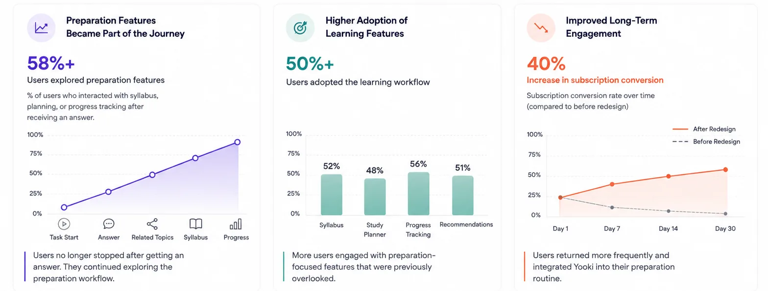
Following a pilot release to our beta testers, the behavioral shift was immediate. Users stopped treating Yooki as a simple search box. Instead of closing the tab after getting an answer, they actively used the syllabus context to plan their next review target.
Lessons from the AI Frontier: Chat is Just the CLI
This project started with a simple assumption: if users had access to AI-powered answers, they would naturally use Yooki as part of their preparation journey. However, the research revealed that solving doubts and supporting preparation are two very different problems.
One of the biggest lessons from this project was that successful features do not always create successful products. The chatbot was performing well at answering questions, yet the product struggled with retention, engagement, and conversion. Looking beyond feature-level metrics helped uncover the larger behavioral problem that users were facing.
Designing a clearer learning journey was."